Tuesday, 12 December 2017

Feedback: Michael, Camille

Mike:  Adjust Brightness and contrast to have more luminosity in your image.
           I still see the ''ring'' around some shapes, have you any reason ?  We don,t have that in the nature and by doing that you neutralize effect of lighting on the arm of the guy in foreground.
           Careful, the cloud shape becomes too specific triangle form.
            Make sure to show the continuity of the background ( same colour) behind the smoke at A&B
Camille: I suggest a toned background, choose any colour you like, the dark background make the lighting glows on your subject.
             You can do some more shading and highlight to give better contrast and  3dimensions to the subject.


Sunday, 10 December 2017

Feedback- Chhoi Ly

The Girl: Good drawing.  For the colour rendering you need better definition in term of contrast, details. Good reference is a must.
I desaturated the the whole colour scheme for more natural skin tone and water. I just retouched a little to show you the need of more work has to be done.
The best way to do that water, first:  look for reference and do it on separate layer. At the end you can lower the opacity of the layer to get the transparency, see through some skin colour.


The knigh: Your studies in composition and tonal  are not done yet.  Remember don't jump too fast to colours. You need to develop , find a better  composition and  masses of tone. Right now it's not ready yet.

Dispose , interplay your masses the way that they look interesting., control the contrast between them. Find the angle of camera to crate drama, strong impression of the scene.
Remember:
Composition
Values
Colour
Edges
Details


Feedback: Dan, Zarabeth, Kris

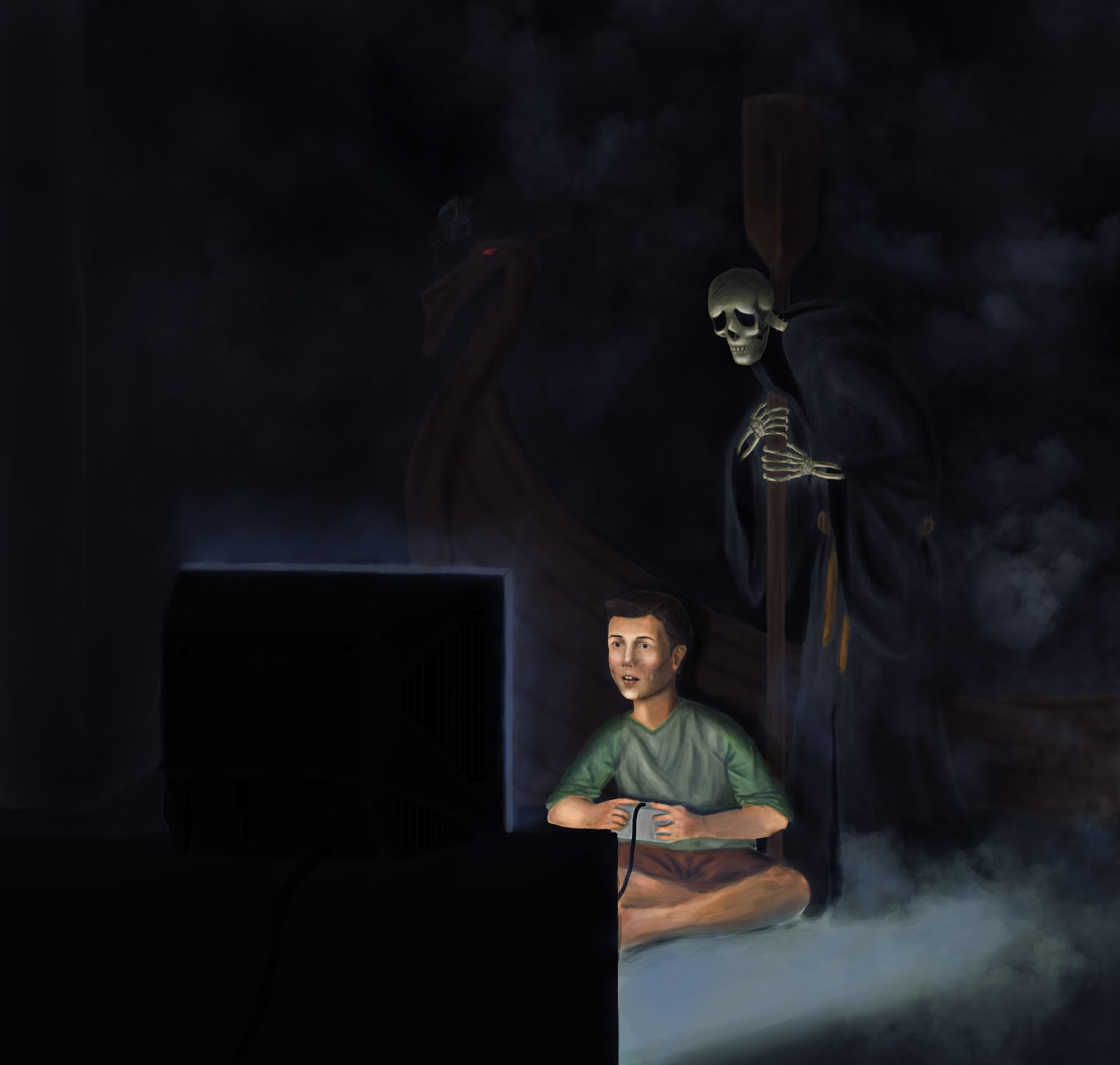
Dan: The posted copy   looks a little too dark, I don't see much all the effect in the background and the boat. -I lighten and adjusted the contrast the whole image before any modification The dead needs some more lighting (even his costume is dark) and darker accent. Don't hesitate to play with some other dark colours in the background.
- More lighter tone on the ship, paddle too.
- The boy: need more definition in details,drapery and lighting effect.... some pictures ( pose yourself with same lighting) will be big help.Shorten the neck, reposition the head as show.


 Zarabeth: Very Nice. Optional: lighten more the horizon as show . I used layer adjustment - select a circle and brighten- blur.

Kris: I adjusted lighter and more contrast  to give more punch and also in colour balance for more vivid colour in overall and mainly skin tone.
Don't use too much neutral gray, rather colourful grey, warm dark. Use hair to expresse movement, action.
-Two hands+ gun darker in foreground, warm and stronger colours, Hands need more definition, some more details, lighting effect . Use reference photos for hands, face...don't improvise at this stage.

Saturday, 9 December 2017

Other Concepts

Hi Charles.  Could you give me some feedback on these two other pieces I create.  Would very much appreciate any advice you can give.  Thanks.


Colors

Hey Charles, looks like I could use some help with the colors with you would be so kind. Having a bit of difficulty.

Final Project Colors

Here's my updated version, let me know if I forgot anything. Thanks!


Friday, 8 December 2017

Final project with colours - Daniel


Feedback: Michael's

Hi Mike,
As you can see on the grey scale copy, the tones of   different masses are too close to each other, not enough contrast and that cause your image looks darker. The colour in general is a little to saturate , especially the green still too strong to go with that kind of lighting condition.
- I first desaturate the colour of the whole image ( image- adjustm-hue/sat) to get a more natural hue in overall.
- Second, lighten the mountain of upper part for more contrast and distance using brighness adjustment.
Some points you need to observe:
- Keep the covering of your colour more uniform, soft blending and don't leave the ring around the shapes. Don't handle the colour as you're colouring in watercolour. Use layers if needed.
- Using some photos of figures will make the work more efficient, easier and better result ( for form, details, shadow, drapery, lighting effect...) Don't improvise too much at this stage.  A tall handsome guy like you, you should at least take a picture of yourself for the big guy &pike in foreground LOL!!


M Falcone Color for feedback


Wire mixup

Hi guys, I think I misstook this wire as mine and took it by mistake. It's a huion wire so whoever has mine let's meet up and exchange

Tuesday, 5 December 2017

Progess

Still have to work on the background;;

Final Project - Colors WIP

I started coloring my piece, and here is where I am so far:


I was inspired by the colors in these pictures. If you have any tips on how I could get close to something like this, please let me know!


Monday, 4 December 2017

Final project


Hi Charles, i've changed my mind (again) on the composition and this is the result (both black and white and color). What do you think about it? thanks in advance!


Sunday, 3 December 2017

Values Progress


Hey Charles, do you think I can move on to colors or does it still need more work?